In my previous post I described how I harmonised ABS census data across three editions onto consistent 2021 boundaries. That was the plumbing. This is the payoff.
I used the resulting dataset to look at how Metro Melbourne's demographic makeup has shifted across birthplace, language spoken at home, and religion - and how it compares to other Australian metro cities and to Regional Victoria.
The short version: Melbourne is diversifying fast, and the rate of change is accelerating.
Birthplace: India overtakes England and China
The most striking trend in the birthplace data is the rise of India as Melbourne's top overseas birthplace.
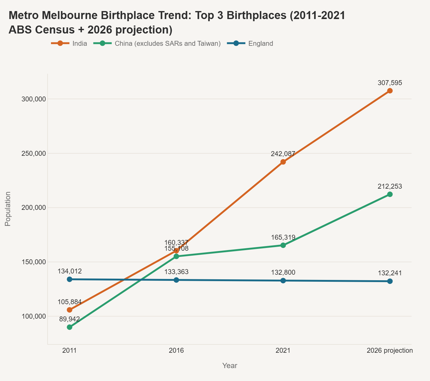
In 2011, England-born residents led at around 134,000, with India at 106,000 and China at 90,000. By 2016, India and China had both surpassed England. By 2021, India had pulled clearly ahead at 242,000 - nearly double the England-born population, which had barely moved across the decade.
The 2026 projection puts India-born residents at over 307,000, with China at 212,000 and England flat at 132,000. England's population is essentially static, while India's growth is steep and sustained.
China's trajectory is worth watching. Growth was rapid between 2011 and 2016, but slowed noticeably between 2016 and 2021, likely reflecting tighter migration policy and COVID-era disruption. The 2026 projection assumes the 2016–2021 trend continues, but this is one to revisit once actual 2026 census data arrives.
Melbourne's birthplace mix vs other metro cities
When comparing Melbourne's overseas-born profile to other Australian metro cities, a few things stand out.
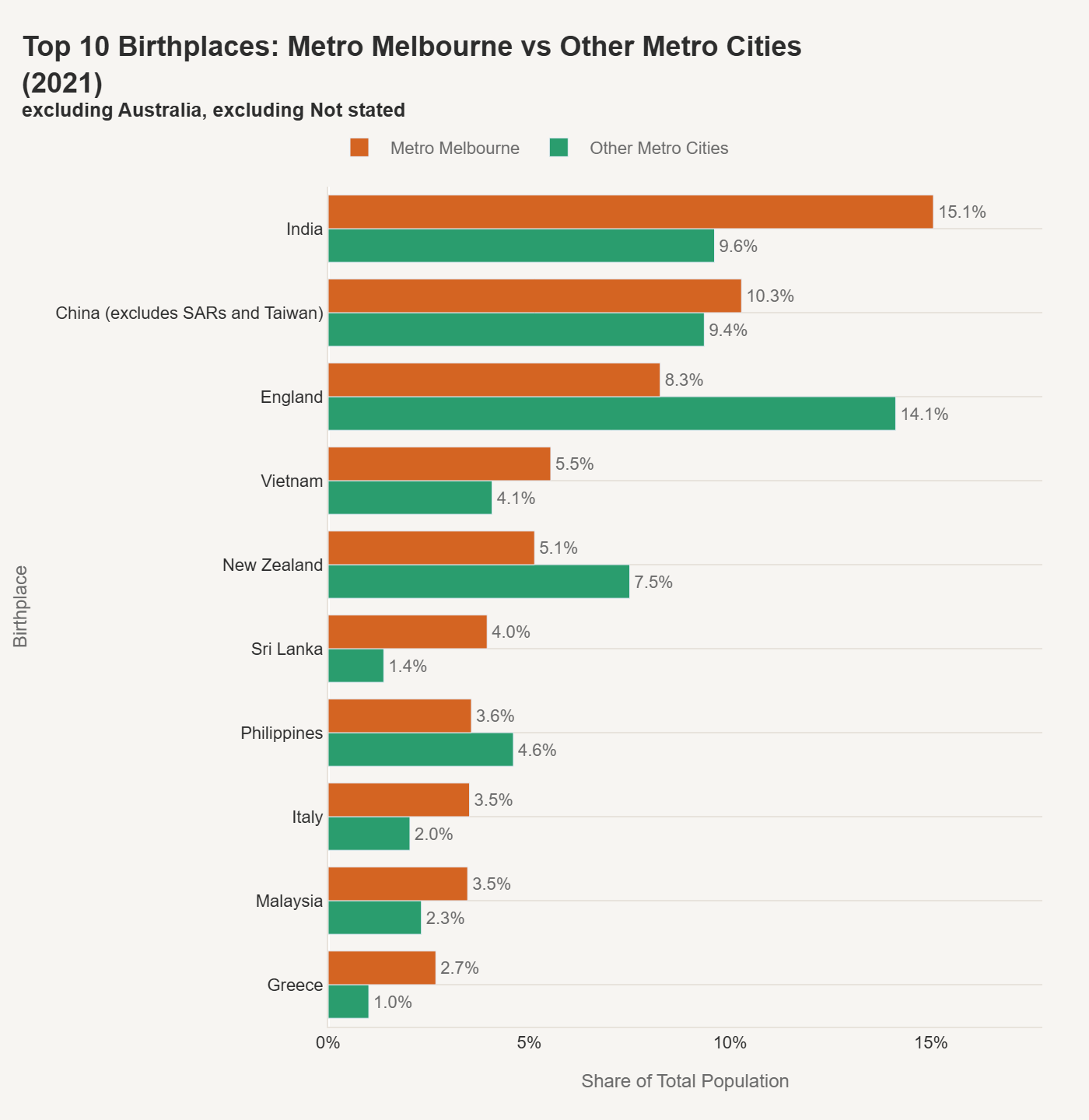
Melbourne has a notably higher share of India-born residents (15.1% vs 9.6% nationally across other metros), and a stronger representation from Vietnam, Sri Lanka, Greece, Italy, and Malaysia. Other metro cities lean more heavily toward England (14.1% vs Melbourne's 8.3%), New Zealand, and the Philippines.
This isn't just a story about which countries are represented - it's about the shape of the distribution. Melbourne's overseas-born population is more evenly spread across South Asian, Southeast Asian, and Southern European origins, while other metro cities tend to concentrate more in Anglosphere and Pacific sources.
Melbourne vs Regional Victoria
The metro-to-regional comparison sharpens the picture further.
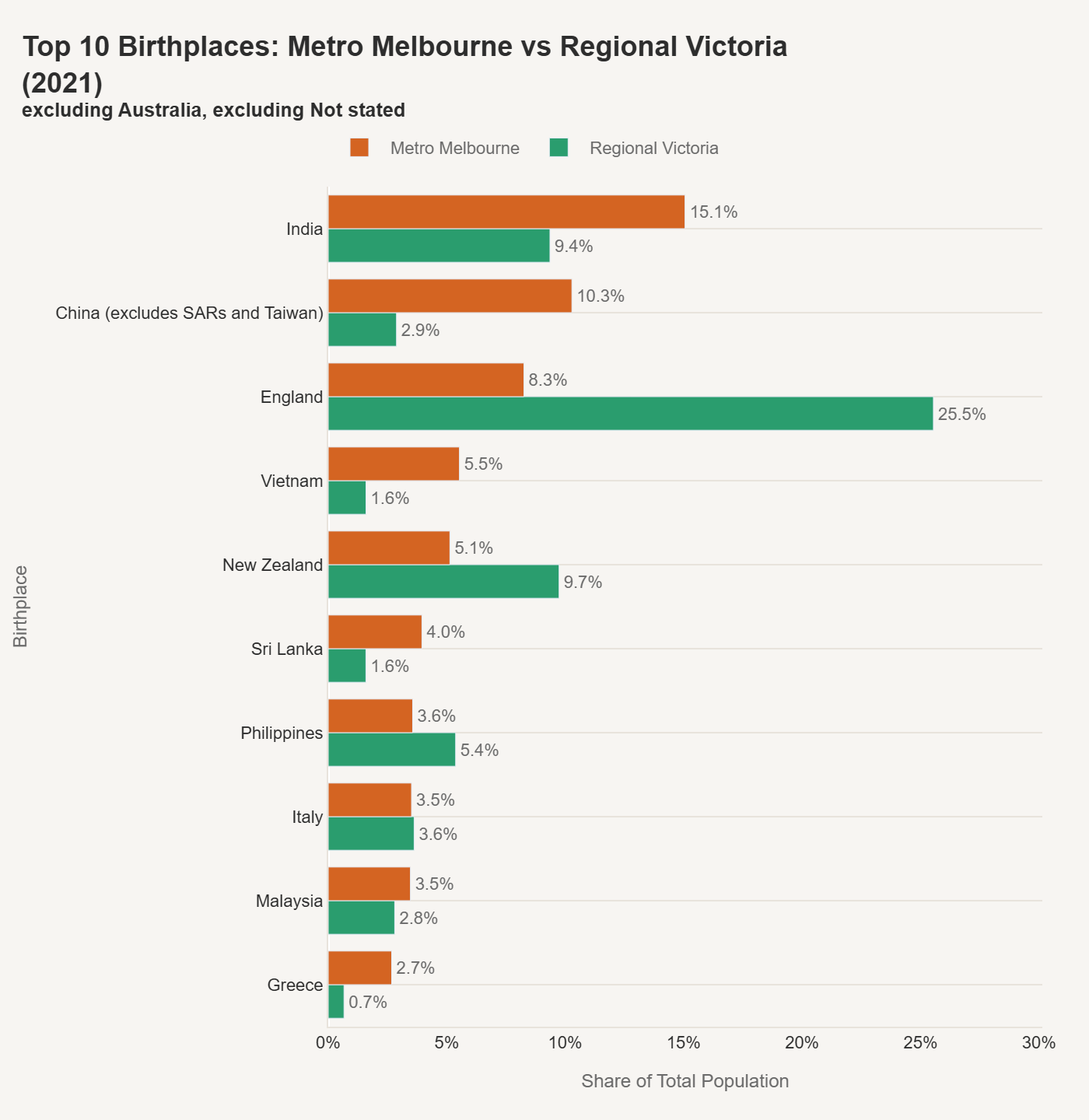
Regional Victoria's overseas-born population looks structurally different. England accounts for over a quarter of it (25.5%), compared to 8.3% in Metro Melbourne. New Zealand is also much more prominent regionally (9.7% vs 5.1%). Meanwhile, China and Vietnam have a much smaller regional footprint - China is just 2.9% in Regional Victoria compared to 10.3% in the metro area.
The practical implication: the services, infrastructure, and cultural fabric that support diverse migrant communities are overwhelmingly concentrated in the metro area.
Language: Mandarin leads, but the spread is wide
Looking at language spoken at home tells a complementary story.
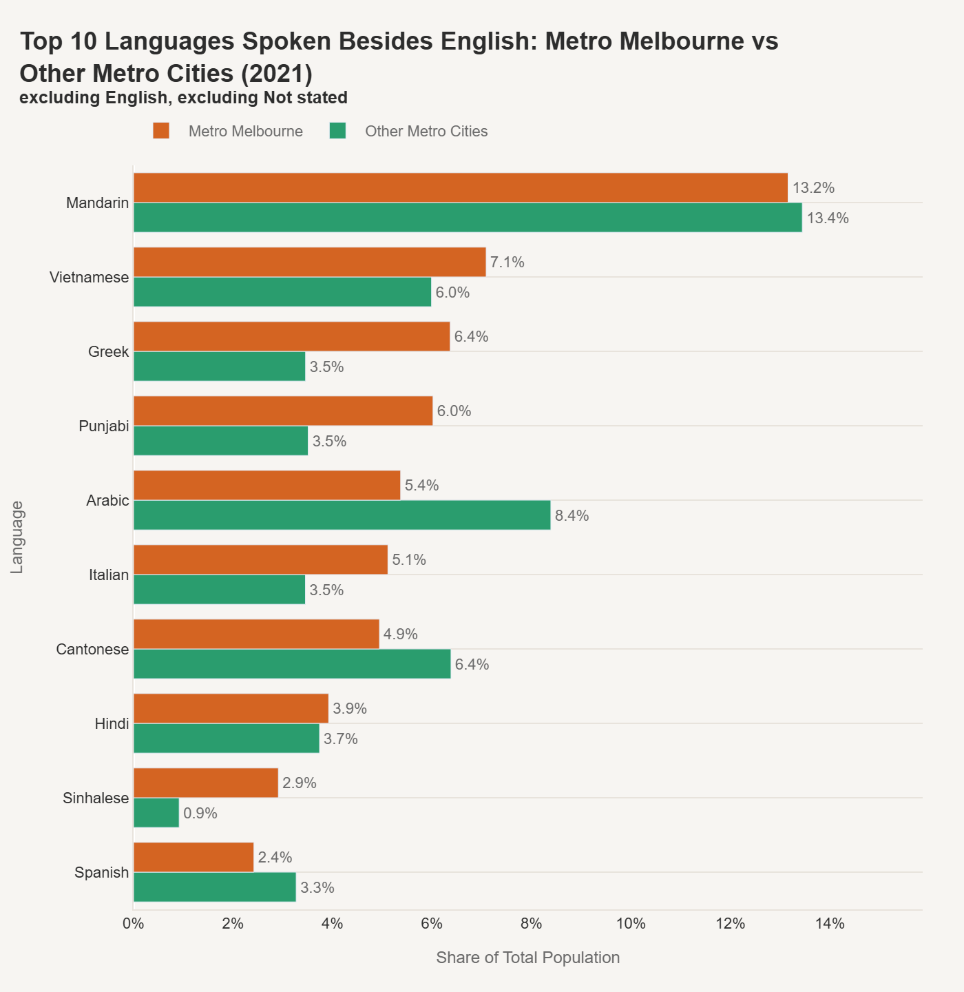
Mandarin is the most common non-English language in Metro Melbourne at 13.2%, essentially on par with other metro cities (13.4%). But Melbourne distinguishes itself with higher shares of Vietnamese (7.1% vs 6.0%), Greek (6.4% vs 3.5%), Punjabi (6.0% vs 3.5%), and Italian (5.1% vs 3.5%). Other metro cities lean more toward Arabic (8.4% vs Melbourne's 5.4%) and Cantonese (6.4% vs 4.9%).
The Greek, Italian, and Vietnamese numbers reflect Melbourne's post-war and 1970s–80s migration waves - communities that are now well-established but still linguistically active across generations. The Punjabi growth maps directly to the Indian birthplace surge.
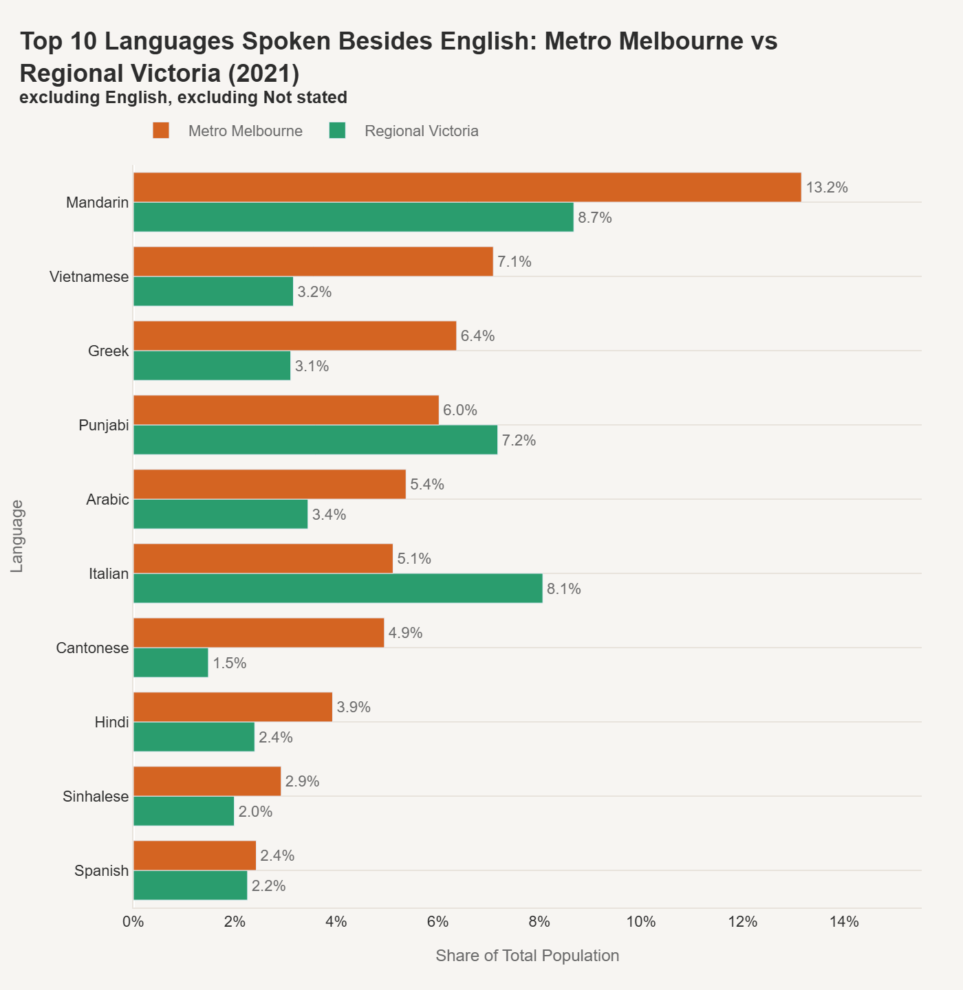
The regional language picture has a couple of surprises. Punjabi is proportionally more prominent in Regional Victoria (7.2%) than in Metro Melbourne (6.0%), likely reflecting agricultural and regional industry settlement in areas like Greater Shepparton. Italian also punches above its metro weight (8.1% vs 5.1%), concentrated in traditional regional centres. Most other languages drop off substantially outside the metro area.
Religion: The secular crossover
The religion data captures one of the most significant structural shifts in Australian society.
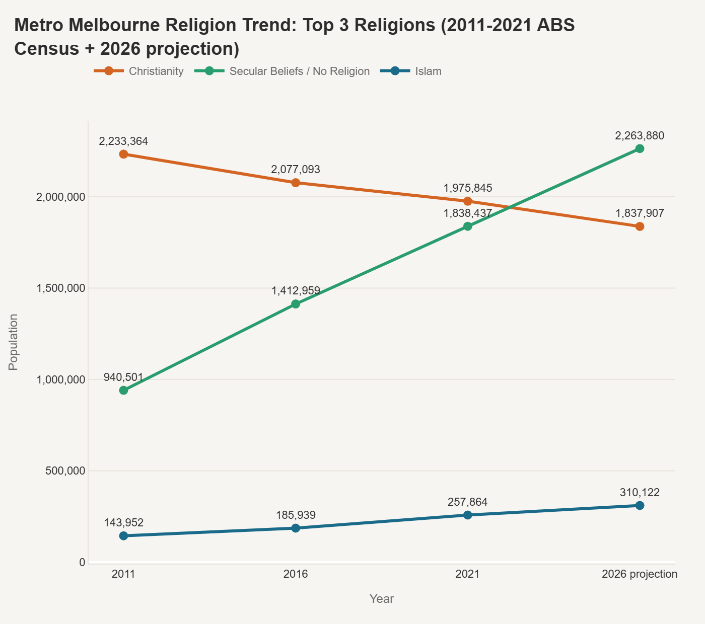
In 2011, Christianity was still clearly dominant in Metro Melbourne at 2.23 million, with secular beliefs / no religion at 940,000. By 2021, the lines had crossed: secular beliefs reached 1.84 million while Christianity dropped to 1.98 million. The 2026 projection puts secular beliefs ahead at 2.26 million and Christianity at 1.84 million - a complete inversion of the 2011 position.
Islam is the third largest category and has grown steadily from 144,000 in 2011 to 258,000 in 2021, with a projected 310,000 by 2026. That growth is consistent and aligns with the broader migration patterns from South Asia and the Middle East.
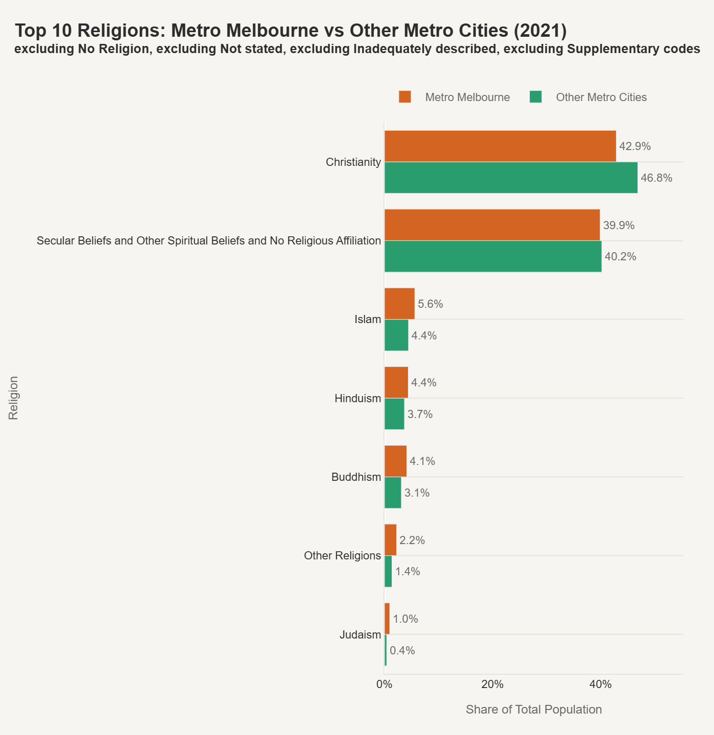
Compared to other metro cities, Melbourne's religion profile doesn't show dramatic differences - Christianity (42.9% vs 46.8%) and secular beliefs (39.9% vs 40.2%) are close. Melbourne has a slightly higher share of Islam (5.6% vs 4.4%), Hinduism (4.4% vs 3.7%), and Buddhism (4.1% vs 3.1%), which maps to the birthplace patterns described above.
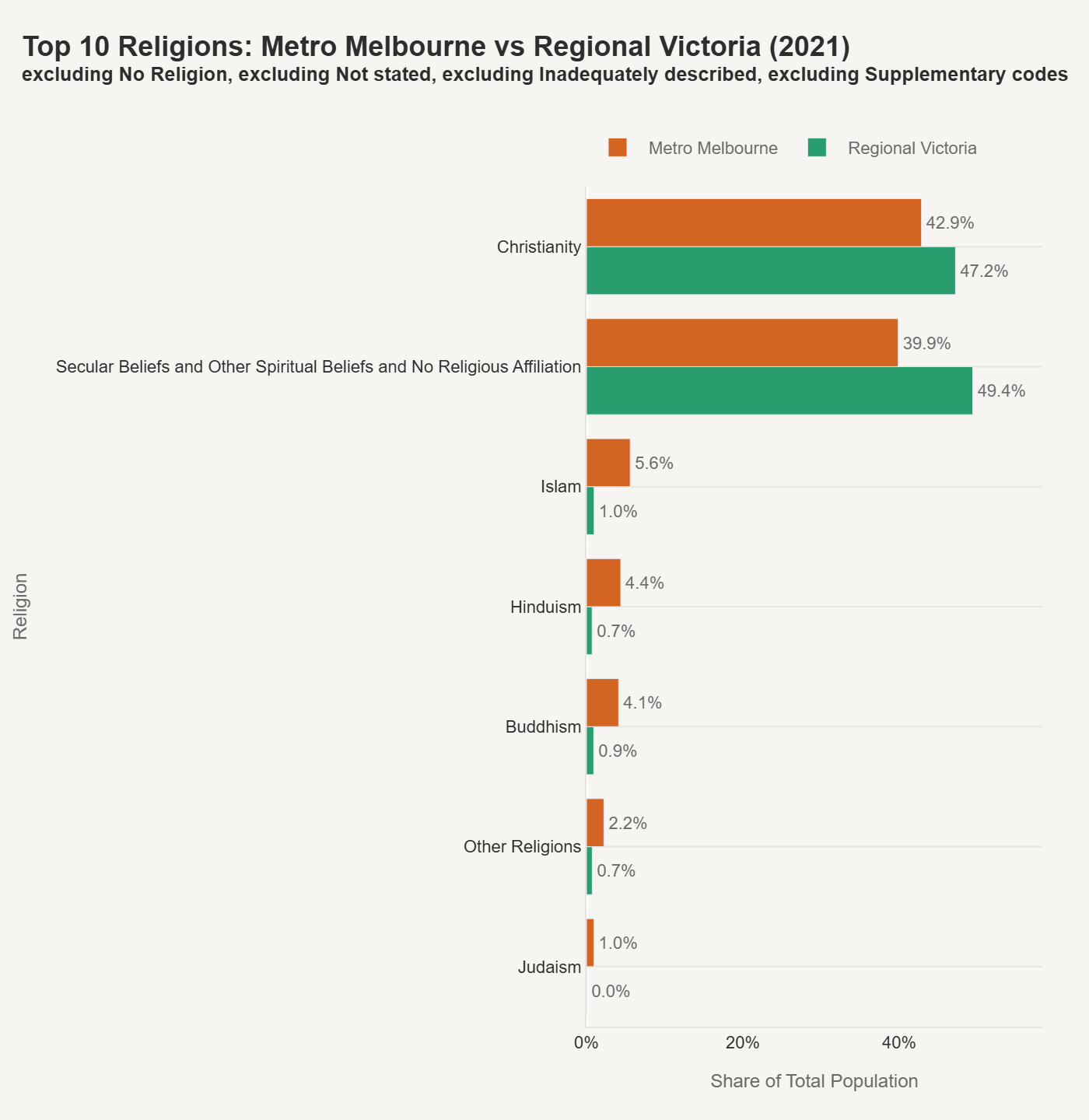
The metro-regional split is more interesting. Regional Victoria is already majority secular at 49.4%, well ahead of Metro Melbourne's 39.9%. Meanwhile, Islam, Hinduism, and Buddhism barely register outside the city - all under 1%. Christianity is slightly higher regionally (47.2% vs 42.9%), but the dominant story is just how secular Regional Victoria has become.
Where is the diversity?
As a final cut, I used a normalised Shannon diversity index to identify which Victorian suburbs have the most evenly distributed mix of overseas birthplaces, basically answering "how diverse is this suburb versus others"?
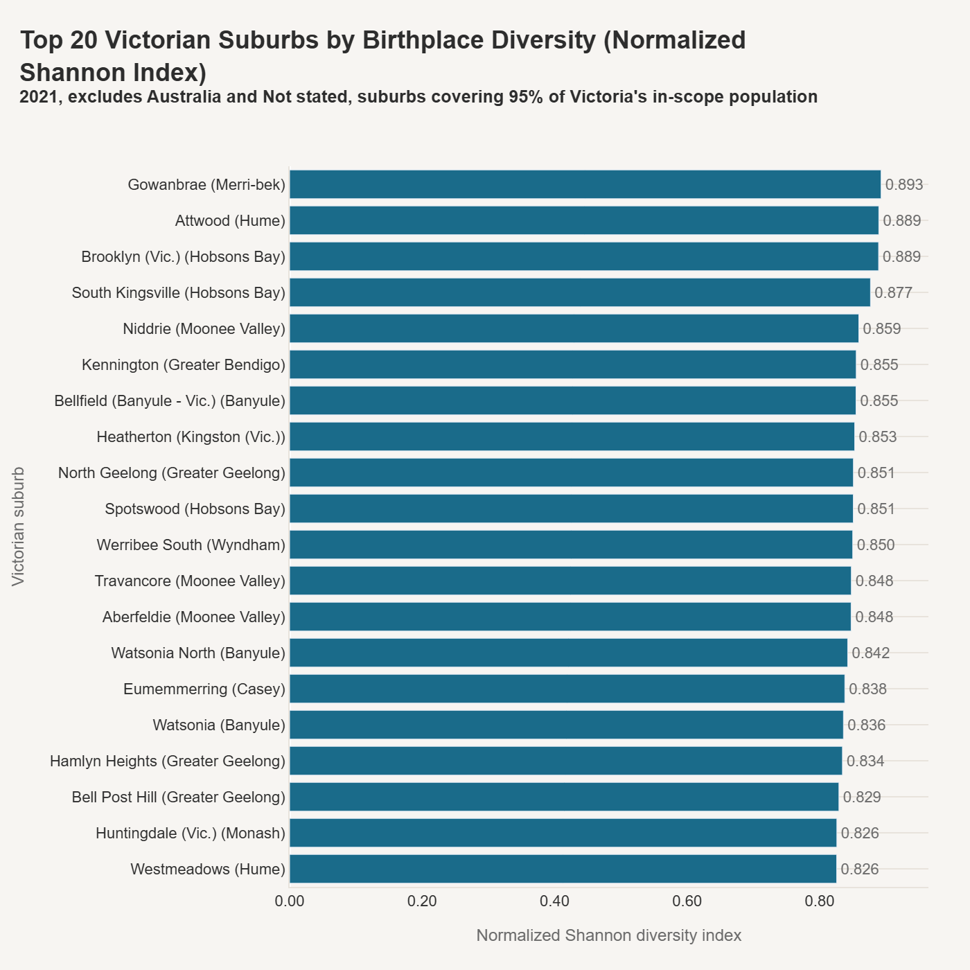
The top 20 list is dominated by middle-ring and outer-ring Melbourne suburbs - places like Gowanbrae, Attwood, Brooklyn, and South Kingsville in the west, and Niddrie, Bellfield, and Watsonia in the north. These are neighbourhoods where no single birthplace group dominates, and the population is spread across many origins.
A few regional entries make the list too - Kennington (Greater Bendigo), North Geelong, Hamlyn Heights, and Bell Post Hill (Greater Geelong) - suggesting that diversity in some regional centres is catching up with parts of Melbourne.
The Shannon index filtered for suburbs covering 95% of Victoria's in-scope population, which removes very small suburbs where a handful of residents could distort the score. That keeps the ranking grounded in places where the numbers actually mean something.
What this doesn't tell you
Census data captures who lives where and what they report on the form. It doesn't capture the lived experience of those communities - how connected or isolated people feel, whether services are adequate, or how identity evolves between generations.
The 2026 projections are linear extensions of 2011–2021 trends. They're useful as a direction indicator but shouldn't be treated as forecasts. Migration policy changes, economic shocks, and global events can all bend these curves.
The real value of this dataset is that it provides a consistent, comparable base. When the actual 2026 census data drops, I'll be able to slot it in and see how well the projections held - and where the surprises are.
The methodology piece explained how to make census geography comparable over time. This analysis is what that effort was for.
If you'd like to view a dashboard where you can explore suburb-level or LGA data, I've created a dashboard here.